Home > Portfolio > Project Tracking System
PROJECT TRACKING SYSTEM
Disclaimer: To comply with non – disclosure restrictions, all confidential information has been replaced with my own for display purposes.
Overview
The task for this project was to create a web-based application that would allow users to view, track, edit projects and their schedules prior to be released on multiple high profile websites. This new software product would allow different user types to monitor project health statuses and communicate across teams.
The challenge
Prior to designing this application, the tool used to perform these tasks was a very complex Microsoft Excel spreadsheet used by everyone in the client side. As anyone would imagine, the spreadsheet required a constant human input to reflect any database changes and updates. Additionally, the software limitations did not allow users to perform all of the essential tasks and a lot of desired key features did not exist…
“We need a tool that will replace our complex Excel Sheet and allow us to track, monitor and modify all of the current, upcoming and archived reports.”
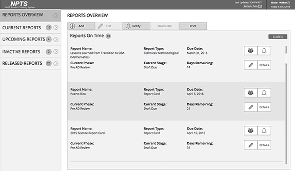
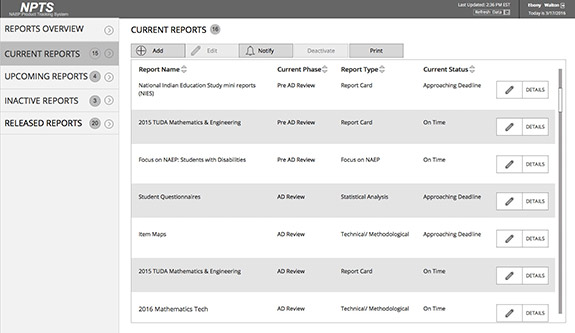
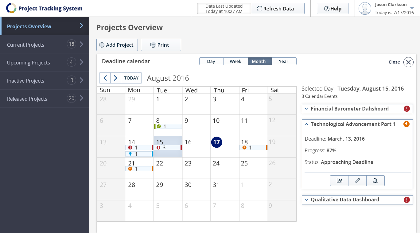
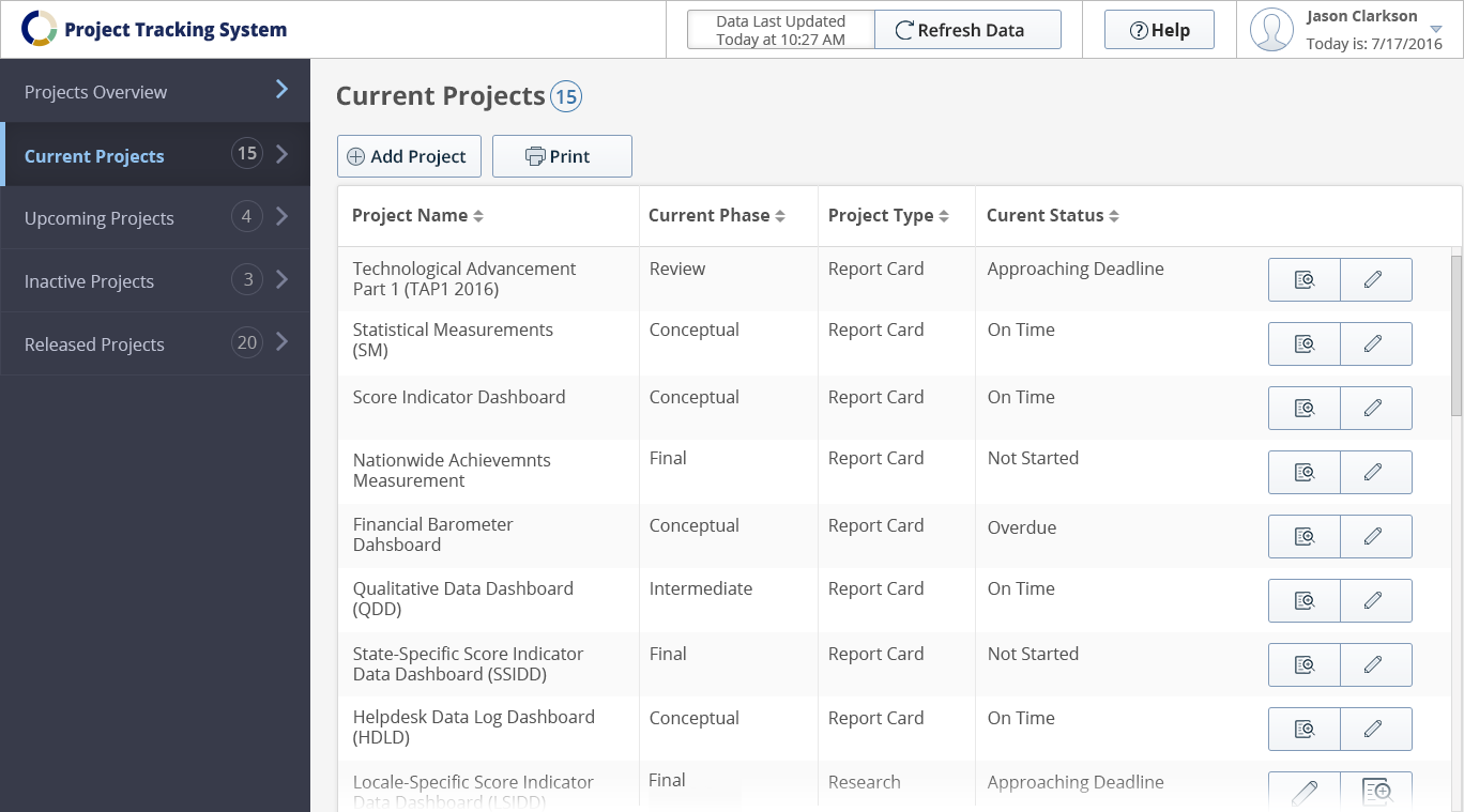
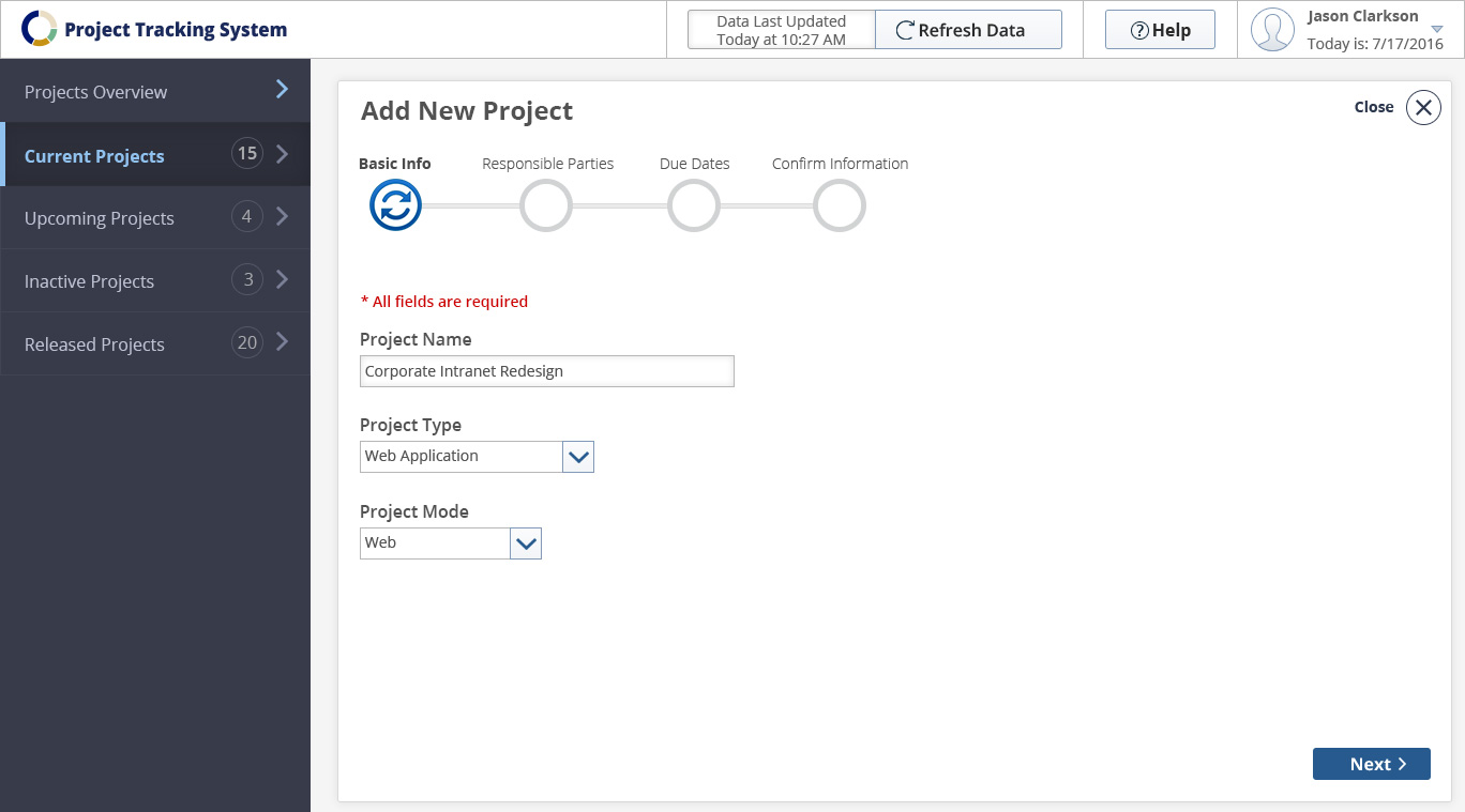
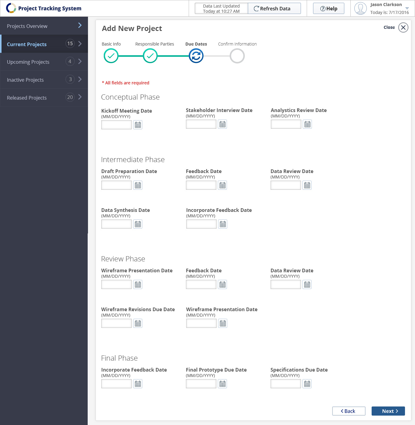
Final application design:

My role
I led the design strategy, conceptualization, direction, deliverables and implementation for the entire lifecycle of the product creation – from concept through execution. I worked closely with one of our UX researchers for the entire design process. We were extremely enthusiastic working on this project as we were given the opportunity to impress one of our very high profile clients with a software tool that would be used on a daily basis and would make their essential tasks so much easier.
The team
This was a collaborative cross-team effort and the team consisted of a project manager, business analyst, UX researcher, two front-end and four back-end developers, as well as two quality control members.
Design project plan
As the only UX Team members on this project, our researcher and I came up with a design plan pinpointing all steps (in a higher level) and phases.

Stakeholder and user interviews
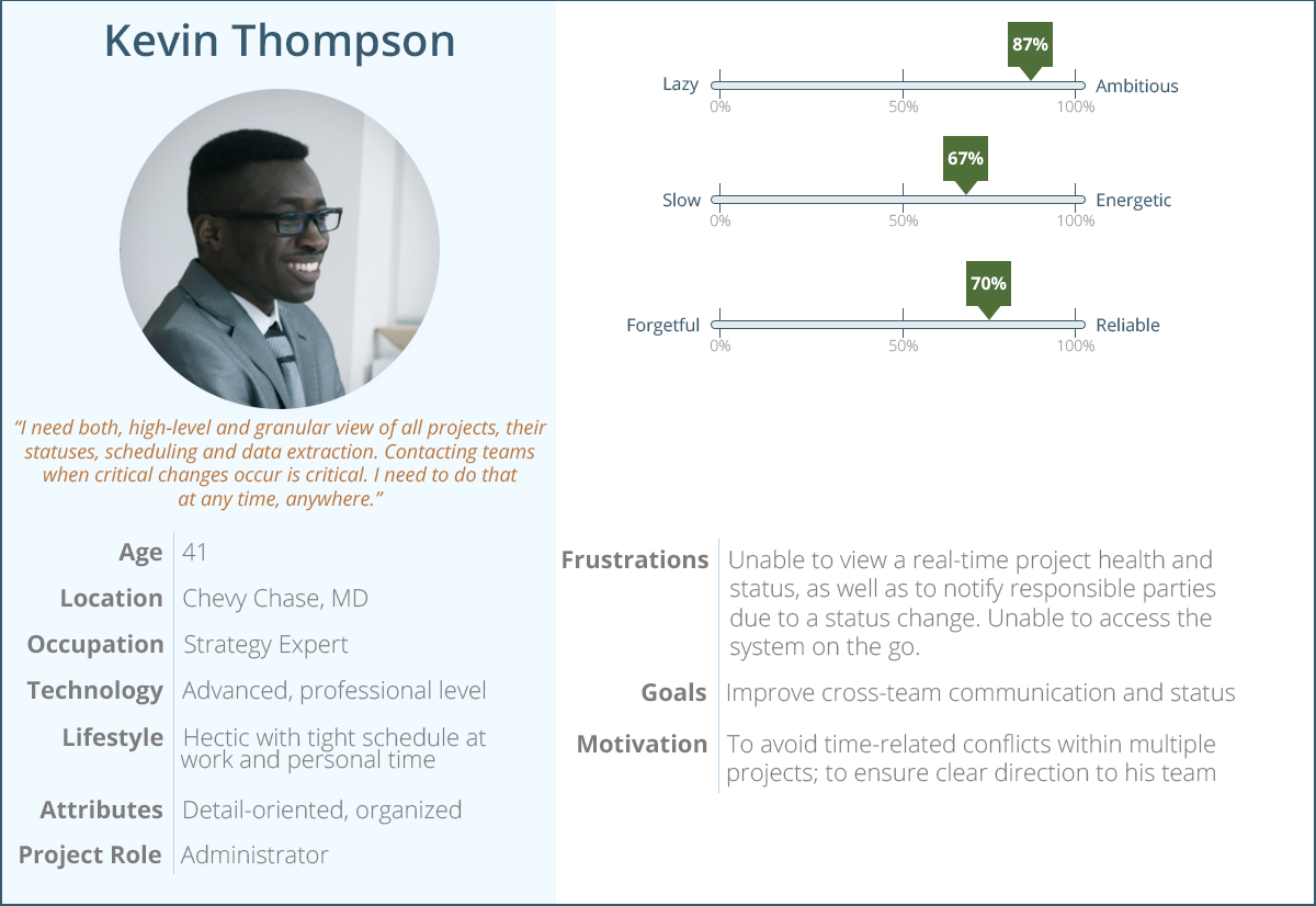
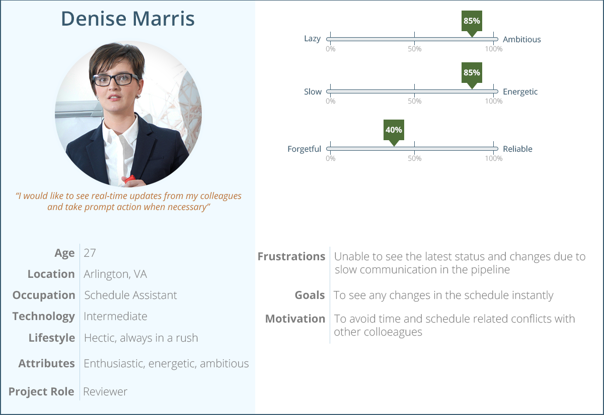
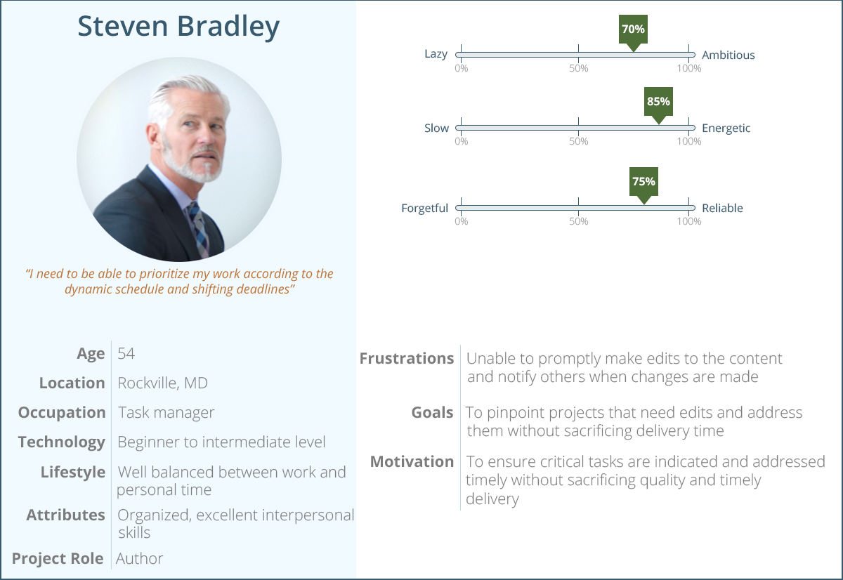
After the kickoff meeting including all responsible parties, we proceeded with in-depth interviews with clients and users. Three user groups were identified – “administrators”, “authors” and “reviewers”. Once logged in to the system, each of the user types would have access to specific to their role tools and information in order to accomplish their tasks.
The UX Researcher and I were communicating with the clients to collect all business requirements for the product. Simultaneously we conducted several meetings with the business analyst assigned for this project who is also an expert in the proprietary content management system that would be used. This was essential for us to understand the limitations and abilities of the software.
User groups & personas
With the aid of user and stakeholder interviews, we were able to identify three distinct user groups based on their roles utilizing the application. Upon login, the system would recognize the individual’s permissions and provide certain functionality depending on their roles.
Administrator – has full access to all functions of the application, able to view, edit, delete and track project health statuses across the entire organization. Has ability to notify anyone in the system in real – time;
Reviewer – has access to the project status directly concerning their work, has ability to notify others for project status changes and updates;
Author – has access to the project status for everyone in the organization and ability to promptly notify anyone for any changes.
We used persona development as a UX technique in order to summarize information about user that would help everyone in our team and stakeholders to understand our targeted audience. Considering the earlier mentioned three user groups, we were already in the right direction.
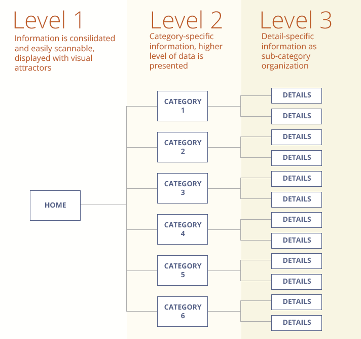
Information architecture
The information collected from the interview sessions and card sorting was the base foundation for establishing the information architecture of the application. Our goal was to structure the information into sections that would allow users to quickly find the desired information at a glance on the home page. From there, they would be able to take a desired action and drill down to lower levels of information as necessary. In other words, establish informational hierarchy.

Brainstorming (sketching, sketching, sketching…)
Ideas are quickly visualized with sketches, then edited, then erased, then all over again… It is a brainstorming process that allowed us to discover numerous amount of moving parts and dependencies. We loved the sketching process as it opened many horizons in terms of solutions for different scenarios.
With all current information on the table, we started the design brainstorming sessions. Sketching on paper and white boards helped us see the early fruits of our work. One of the requirements was the application to be responsive, but only certain features to be disabled on a smartphone. The editing function on those small devices would be disabled and the rationale behind it was that editing project statuses on the go would have been prone to errors with negative impact. There was a consensus that all critical tasks would be enabled on a laptop and desktop, but not tablet and smartphone. We had sketched (and erased) numerous variations until we were satisfied with results that were worth sharing with the rest of the team and client to receive feedback and explore further.
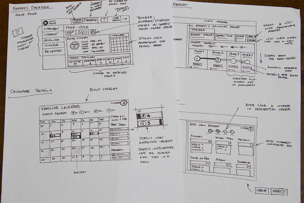
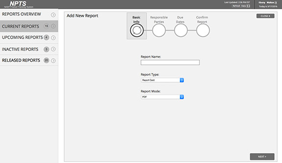
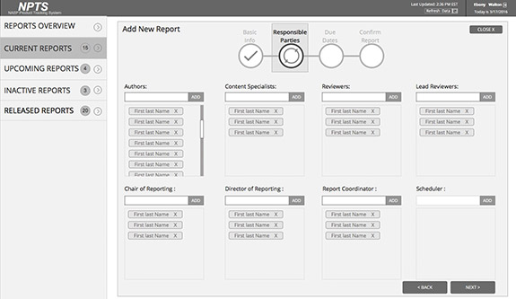
Process flow diagram for adding a new report
This an overall process flow for the major tasks that Admin user takes for viewing, editing, deactivating and activating projects.

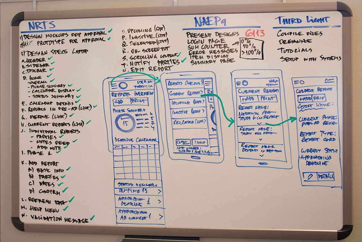
Wireframes
After presenting the sketches to the team and then to stakeholders, we moved on to the next level – digitizing the ideas and bring them to life. Using Axure RP the sketches were incorporated into low fidelity and later into high fidelity clickable wireframes to demonstrate the interactions. The convenience of the rapid prototyping is that no coding is necessary to create clickable demo and is easy to edit on the fly.
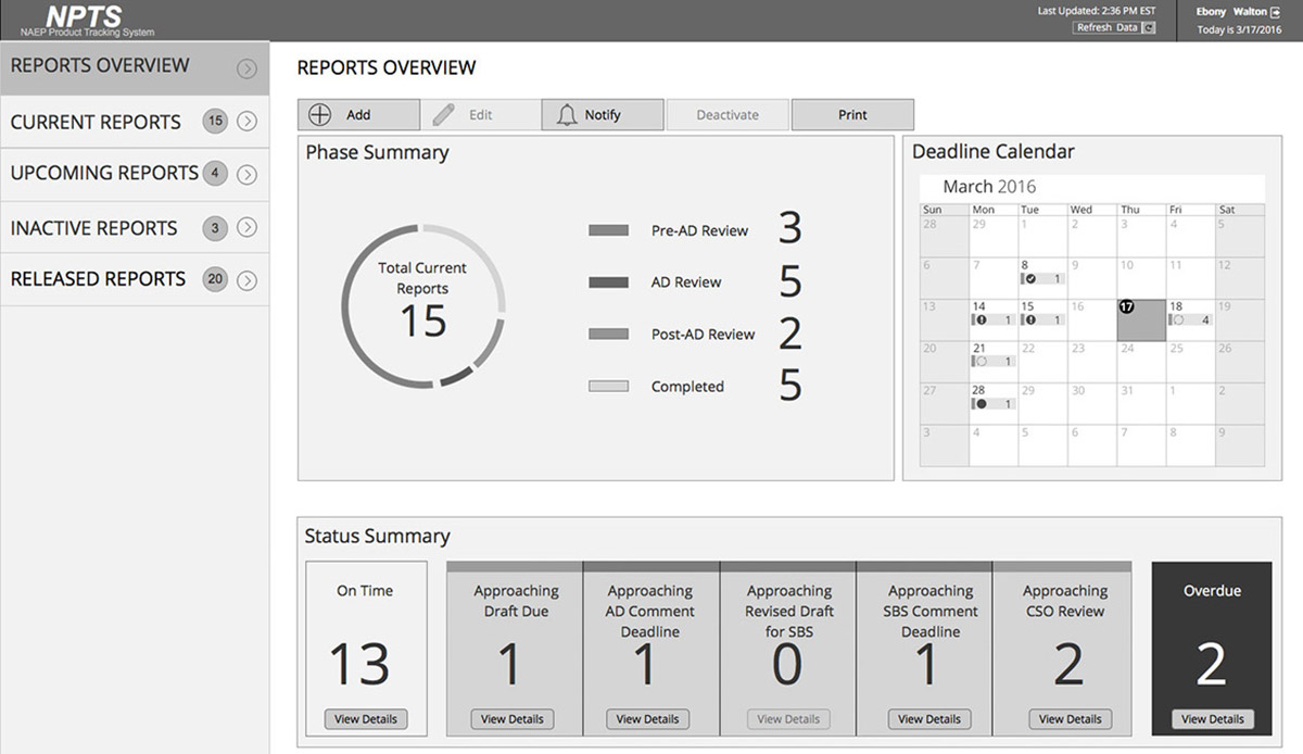
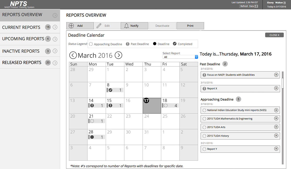
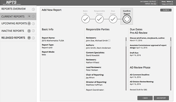
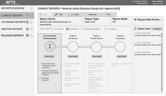
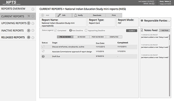
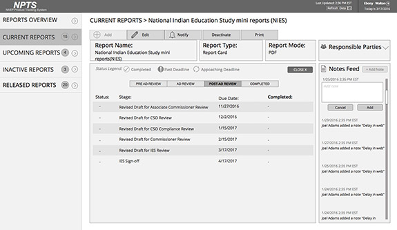
High – fidelity design mockups
I created a full set of high fidelity design mockups to visually demonstrate the product before even the first line of code was written. I used Photoshop CC to create all designs and assets in a way that would accommodate responsive design. The flexibility of vector-based editing in Photoshop allowed me to design and apply effects that would be easily editable and implemented in HTML/CSS down the road for variety of resolutions. The same HiFi design mockups were used to build the clickable HiFi prototype share with the client.
The left navigation was implemented with “drawer” sliding effect allowing users to see the content optimally in small devices. The majority of the manipulations within the applications were completed in the main area and the sidebar was used less frequently. This justified the show/hide effect on the navigation without sacrificing usability.
Design validation
I created a validation plan for both UX and QC team outlining the exact areas for validation in order to avoid duplicate work while ensuring that development fully matches the approved design. As expected, mainly because of time constrains, there were many bugs in the UI, but with the help of additional front-end developer, we were able to bring the interface intact and as appealing as the design mockups.


Outcome and feedback
The feedback we received was great! The clients and direct users were extremely satisfied with the functionality of the application, its intuitive interface, ease of use and attractive appearance.
_______
“You have raised the bar in project tracking in our organization and this application will make our everyday work so much easier and productive!!!” E.W. Program Director
_______