Home > UI/UX Design > Large-Data Responsive Website
LARGE-DATA RESPONSIVE WEBSITE
My role
UX design, requirements gathering and analysis, information architecture, interaction design, user testing, UI design, creative direction, design guide.
Project overview
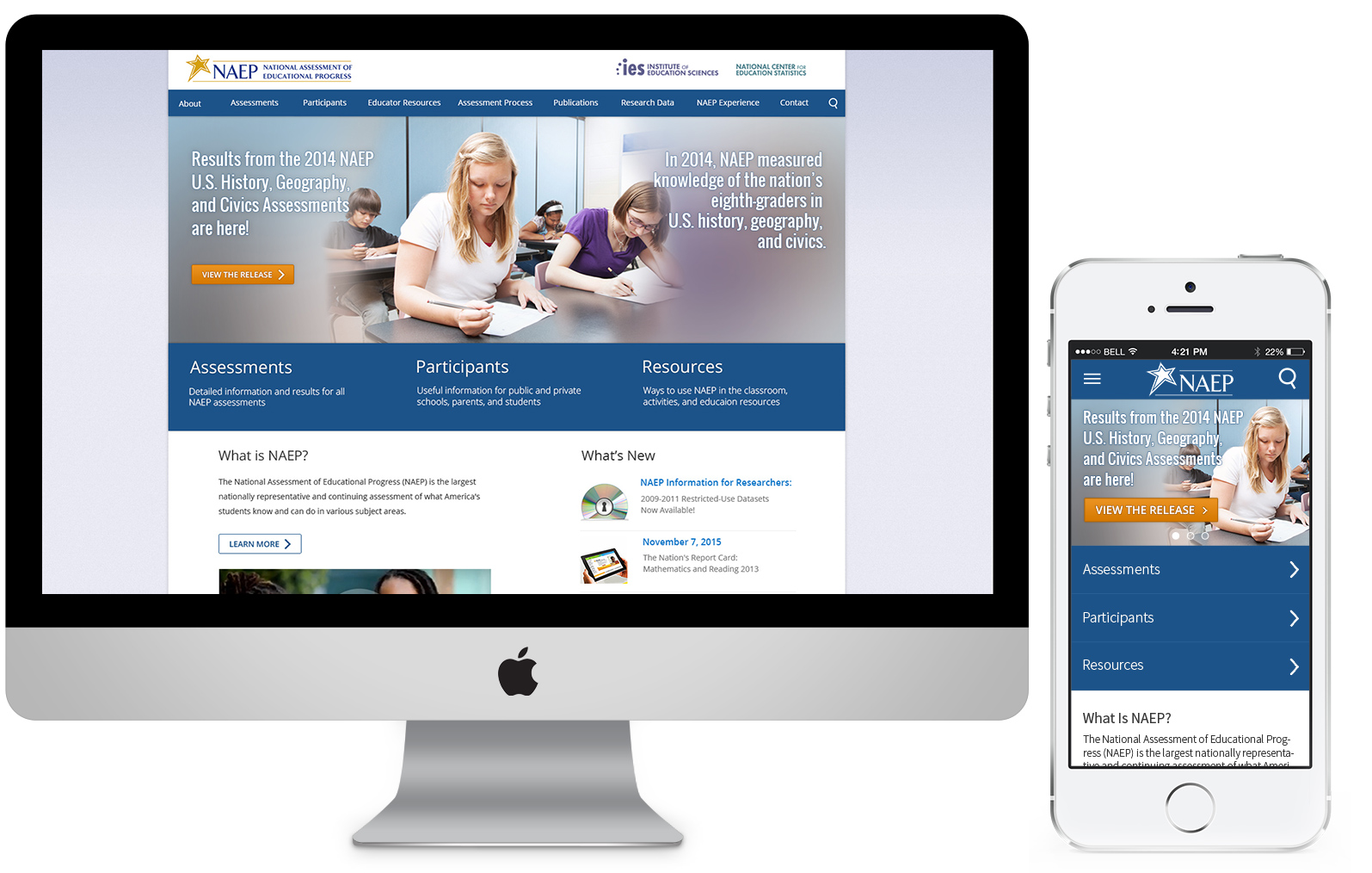
The objective for this project was to redesign the informational architecture, navigation and visual design of this large-data website and unify user experience across multiple devices. The NAEP (National Assessment of Educational Progress) website is a large information site documenting the whole of the NAEP program and archiving all assessment results since the first assessments were administered in 1969. The site comprises over 6,000 pages.
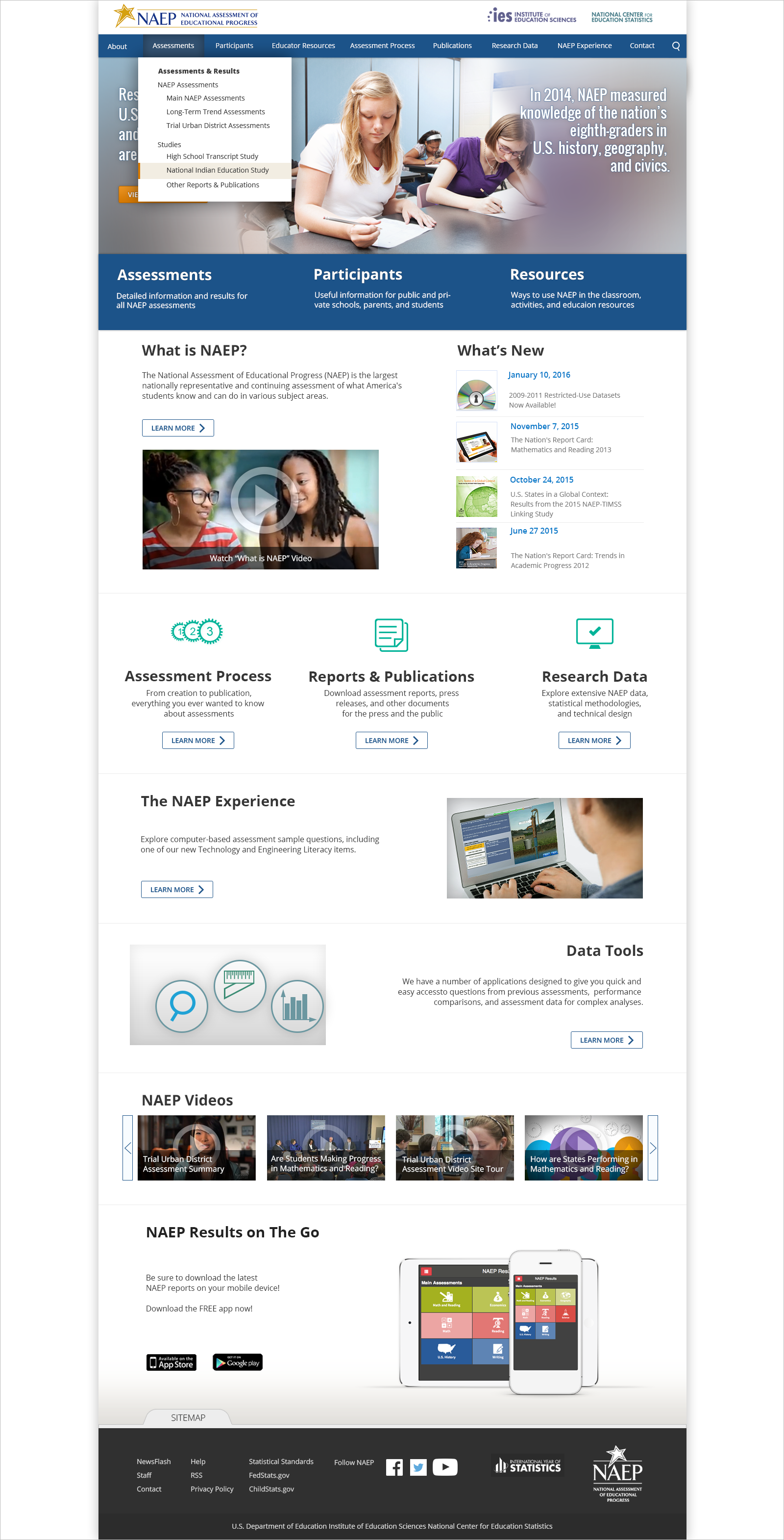
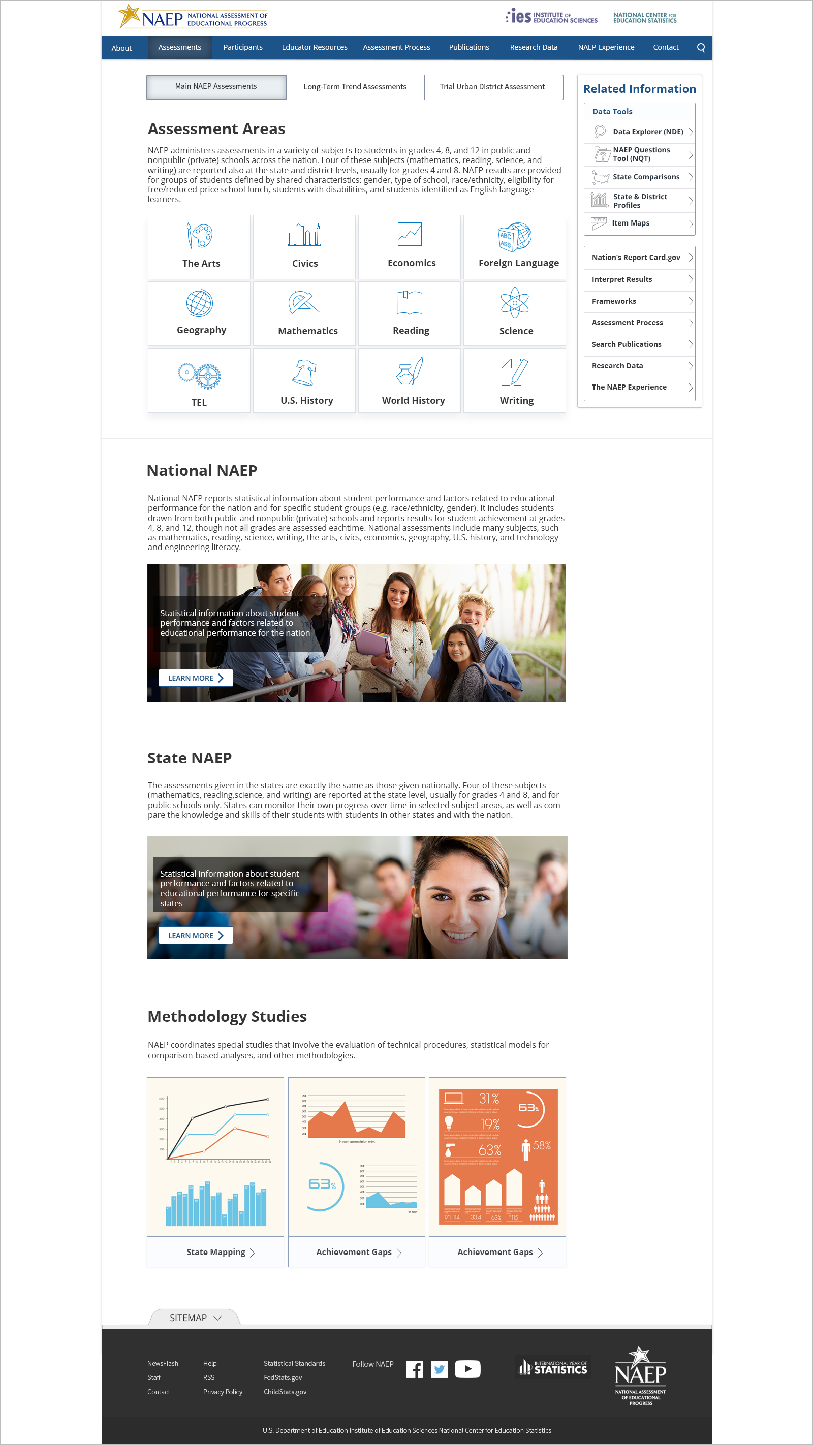
Approved Final Design
The challenges
From usability standpoint, the initial design suffered from several pain points and those of highest severity were:
Inconsistent information architecture across page levels
Text-heavy content blocks
Important page links were hidden within large “walls of text” as inline text links
Lack of distinct visual cue of currently viewed location and navigating between other
Lack of salient signifiers pinpointing call to actions, links and other navigational elements
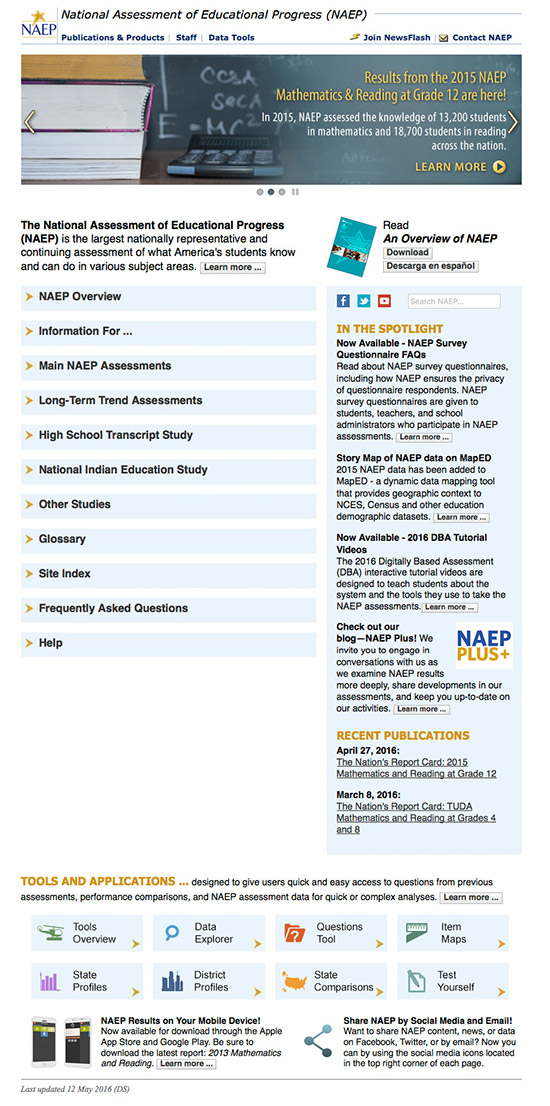
Home page screenshot of the initial design
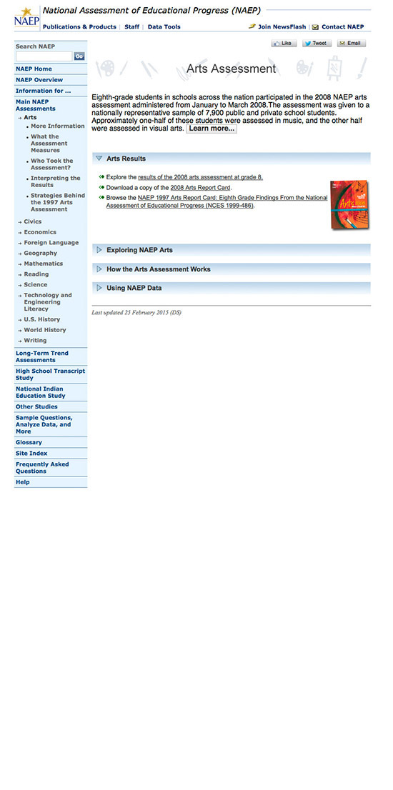
Second – level page screenshot of the initial design
Information architecture
I worked closely with a UX Researcher and three content specialists on establishing the overall architecture of the new site. In efforts of establishing consistent architecture, we had the freedom of editing and creating new pieces of content that would make most sense for the particular section and its relationship with other levels. We established an overall information hierarchy across all of the pages as well as within individual pages.
After multiple meetings discussing and analyzing the content, we agreed on sorting the most important information into four main levels of IA:
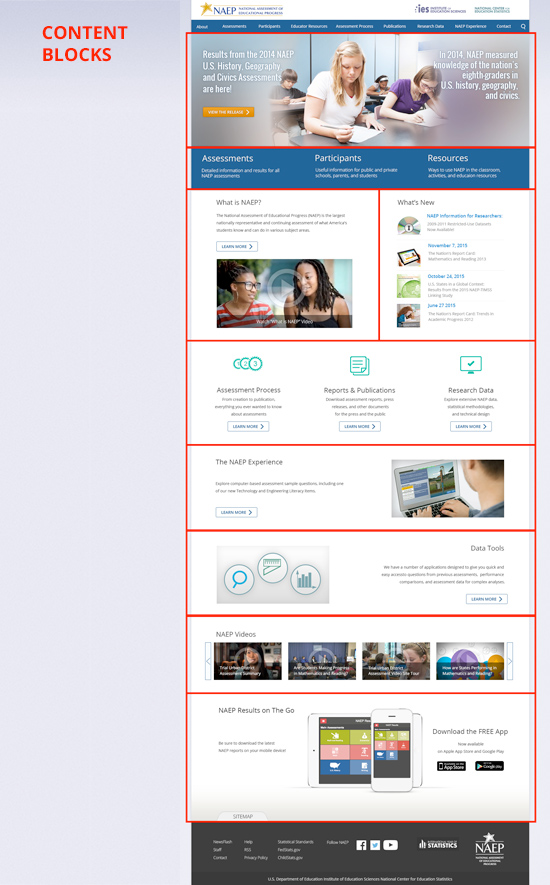
Level 1 (Home page). To establish a hierarchy within the page, the most important (defined by the stakeholders) content and information was brought in a higher level and made more prominent. Text-heavy content blocks were broken down into easy to scan elements, visual attractors (photographs, graphical content, icons, video thumbnails), short descriptive text and Learn More buttons.
Level 2– (Category pages). This level allows users to “learn more” about a specific category and find additional related information. In some cases, Level 2 has its own sub-level if information, which led us to insert Level 3.
Level 3– (Content pages). In this level, users were able to discover another branches of Level 3 and navigate to other related information.
Level 4– (Details pages). Our contractual agreements were limited to the third level of IA, which meant that we had no control over the lower level pages in terms of editing content. For those lower level pages, we “converted” the existing content to the extend of styling only- matching the page width, applying the same typography and colors.
Information access
Once the information architecture was defined and approved by the stakeholders, it mapped out the relationship between all page levels and we arranged the content as follows:
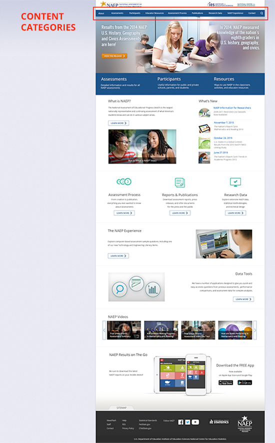
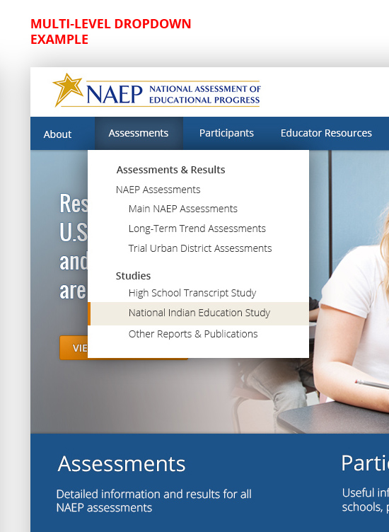
Content categories: accessible by a global navigation bar)
Content blocks: sections of the page combining visuals and text for each topic)
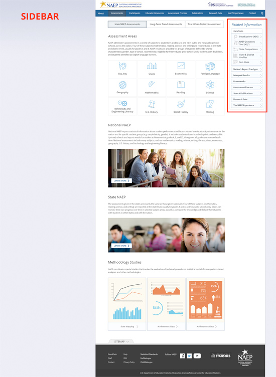
Sidebar: allows quick access to related information).
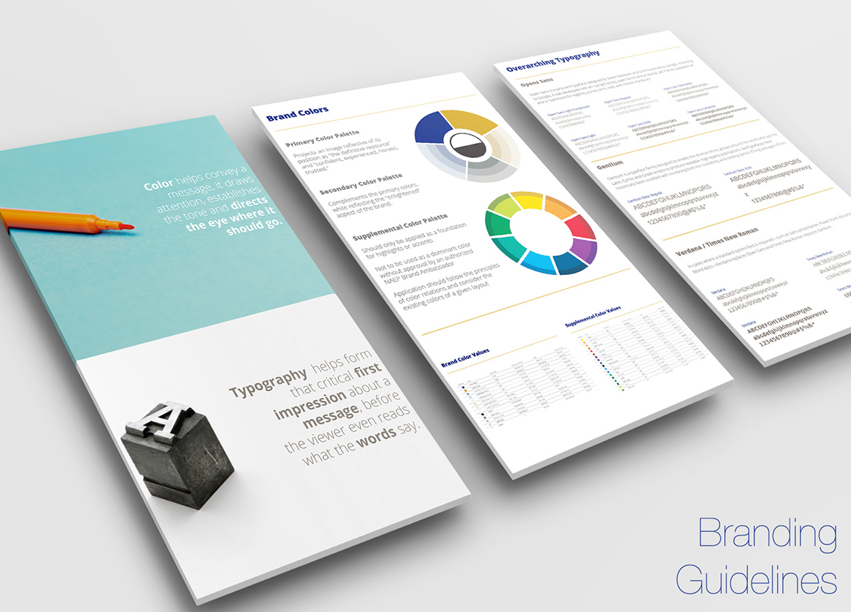
Branding
The overall look and feel of the website and entire educational program is dictated by a branding style guide that defines color palette, typography and iconography that are used globally in digital and print media.
Desktop Navigation & Design
I used Photoshop CC to create multiple high fidelity design mockups for the three levels of of IA. The color palette was influenced by the branding guide which was already established for the program for print and digital products.
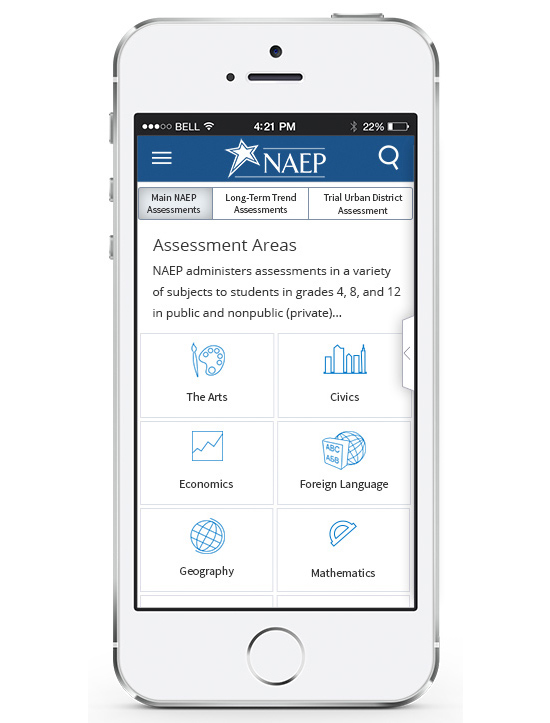
Mobile navigation & design
We selected Bootsrtap as a base framework for our responsive design as it provides a lot of flexibility and convenience. Our goal was to provide the same experience on both-largest and smallest available screen sizes without sacrificing any important data and information.
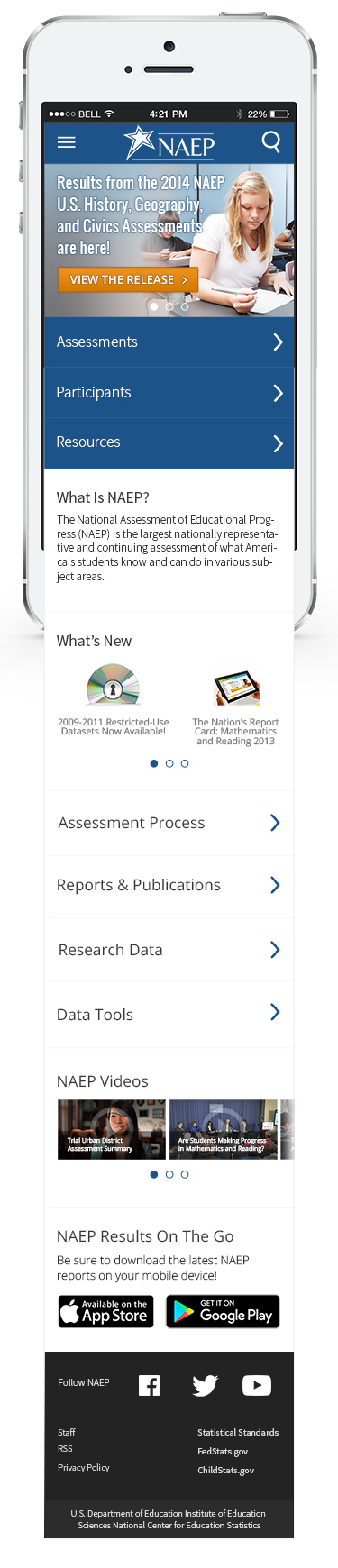
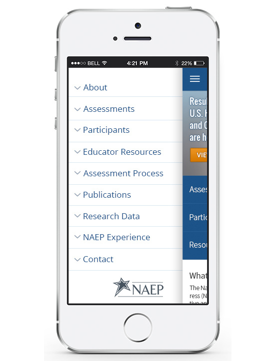
The navigation bar from the desktop version was converted into a side “drawer” menu providing vertical access on a smartphone and small tablet (AKA “hamburger” menu). This type of menu allows users to access the second and third level of pages, 100% pure representation of the horizontal navigation as seen on a large screen.
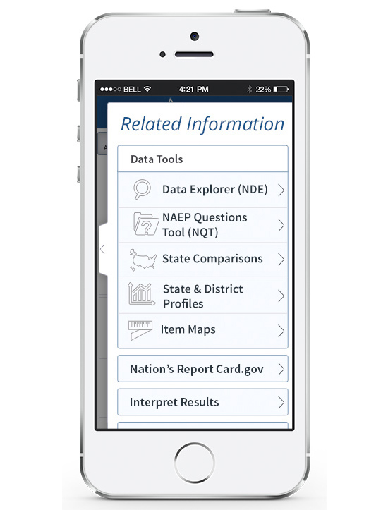
The equivalent of the side bar (as seen on the desktop layout) is a hidden “swipe-out menu” allowing access to the desired related information.
User testing
We chose in – person script – based think aloud user testing method with users from our organization. Some of the participants that we selected for the testing were completely unaware of the nature of the website, others had some information about it, and others were highly informed.
Our team highly benefited from the user testing as we were able to determine the success of many areas and improve upon. We were able to identify problems that were rectified early in the design phase. Test early, fail early 🙂