Home > UI/UX Design > Corporate Website
CORPORATE WEBSITE REDESIGN
My role
Understand business goals and the rationale behind the need of redesigning the existing website, perform competitive research analysis, indicate areas that suffer from meeting the business goals, create new information architecture, interaction design, UI visual design, create design specifications for implementation, design project management.
The challenges
Initially, the corporate website was built with a non – responsive framework and all of the information was presented heavily condensed, all “above the fold”. That was highly desired approach by the stakeholders for the redesign effort as they were influenced by the mind set of “users don’t scroll” and that all information should be presented on the screen at once. My personal goal was to collect a solid amount of justification for steering away from that approach and direct into more modern, responsive and “users do scroll” approach.
Another challenge was breaking through the established mindset that the website should look and feel like a “construction environment”. Significant percentage of the users fall into construction type of organizations, urban planning and development agencies. To the stakeholders, this meant “we cannot be creative, we should make the website look like a construction website”. Literally!
My task was to help bring awareness to the company for new technologies, usability principles, visual appeal and their direct impact on the return of investment for the company.
Project overview
I led the redesign of CDR’s (Creative Design Resolutions, Inc.) website which was the beginning of the company’s complete branding refresh. CDR specializes in aesthetic master planning services on infrastructure development all over The United States. Serving as the Digital Art Director/Design Manager for the company, along with two other sister companies, I was in charge for the entire visual appearance of the organizations in web, print and digital environments. This project was one of the many that I was in charge of during my nearly five years of employment at the company (and sister companies).
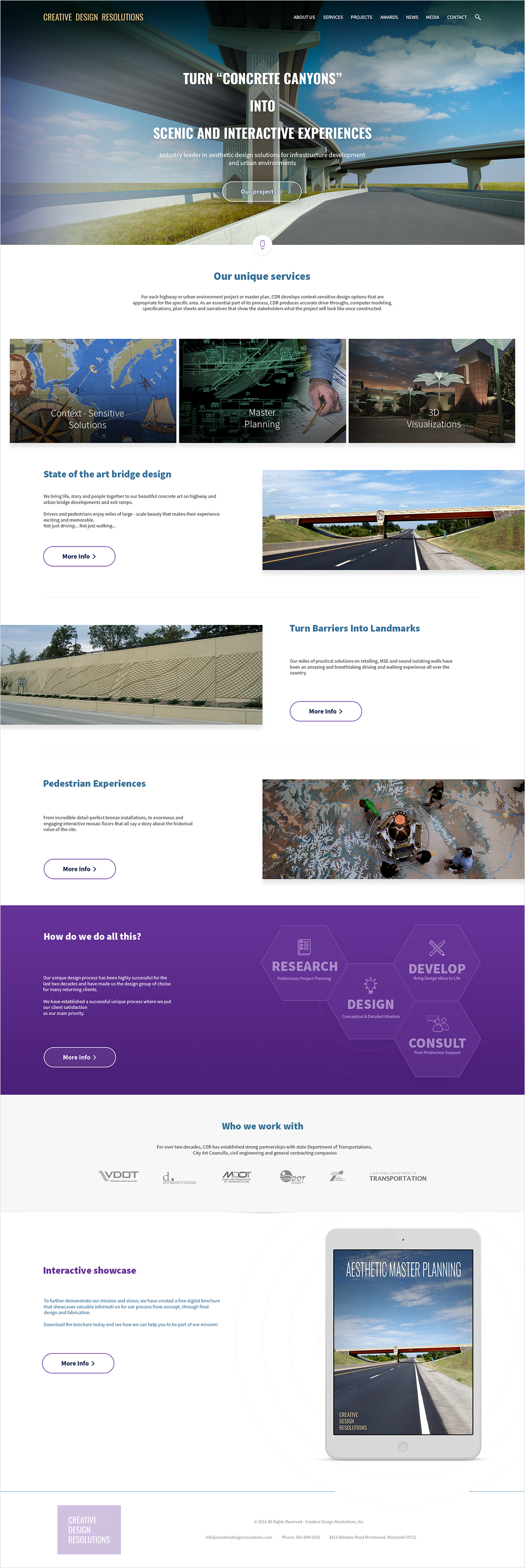
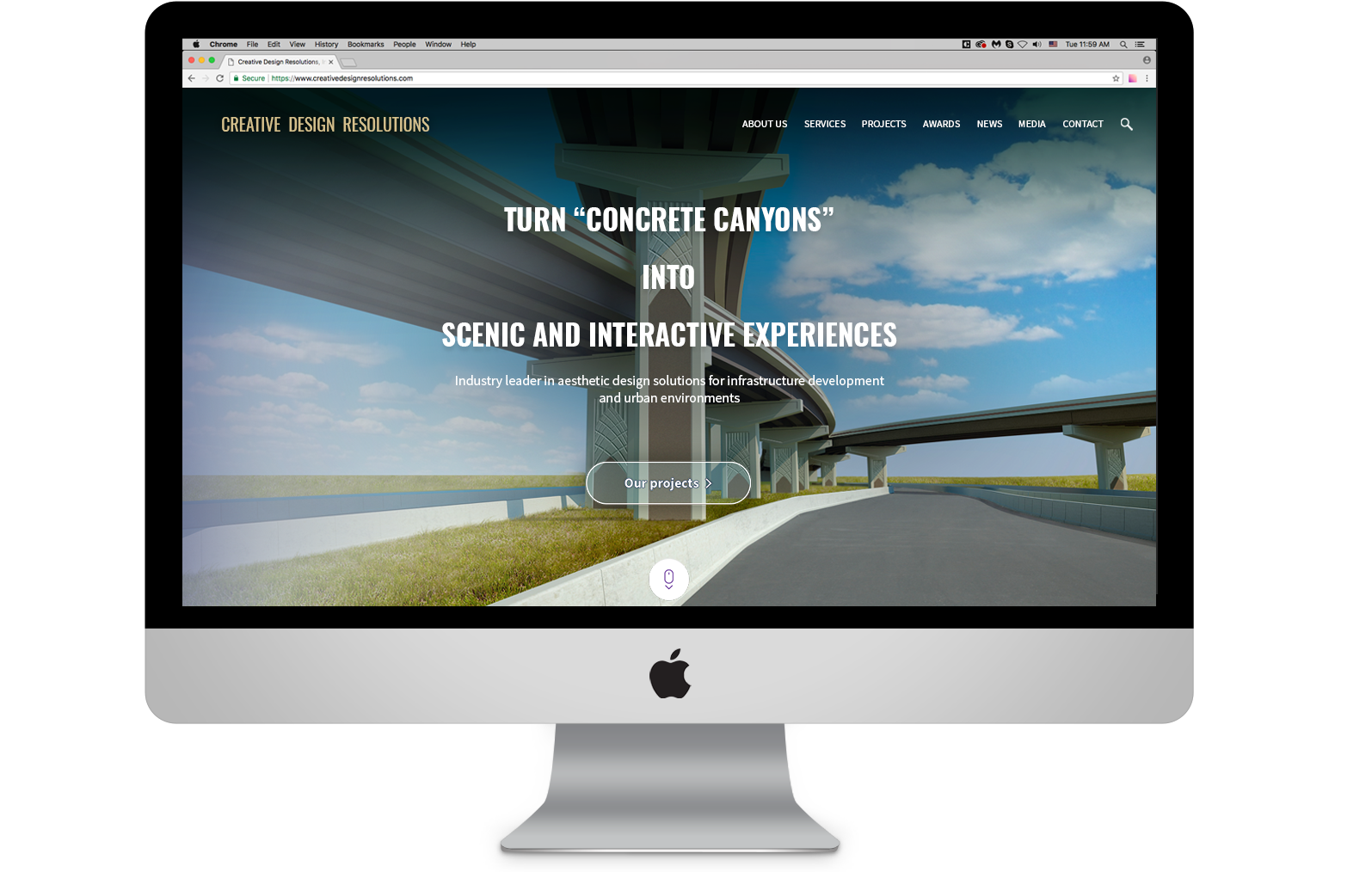
Below is a mockup of the approved home page of the redesigned site:
Stakeholders interviews
The CEO and the Marketing Director were the key people who I interviewed and gathered user goals, features and requirements from. The direction was towards increased corporate visibility and sales of the services, appealing visual appearance to the existing and prospective clients.
Usability evaluation
I performed usability evaluation of the initial website and compiled a list with areas for improvements. I presented a list with violations and pinpointed areas for improvement considering the overall goals for the new site.
“Everything above the fold?”
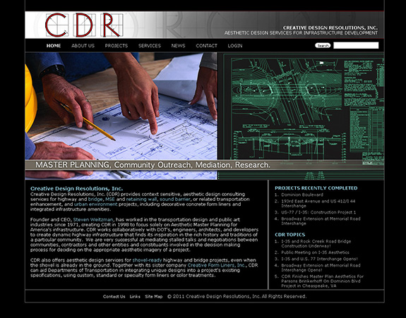
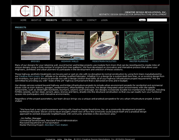
One of the major issues was the “all above the fold” structure of the information. All pages were designed with the same page height (approximately 800px) which resulted in compressing the essential information in a small encapsulated area, crunching up important informational and navigational elements and sacrificing discoverability. Other examples were lack of signifier saliency – heavy use of visually non – distinct call to actions, massive text blocks with embedded links.
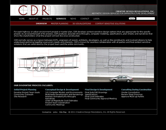
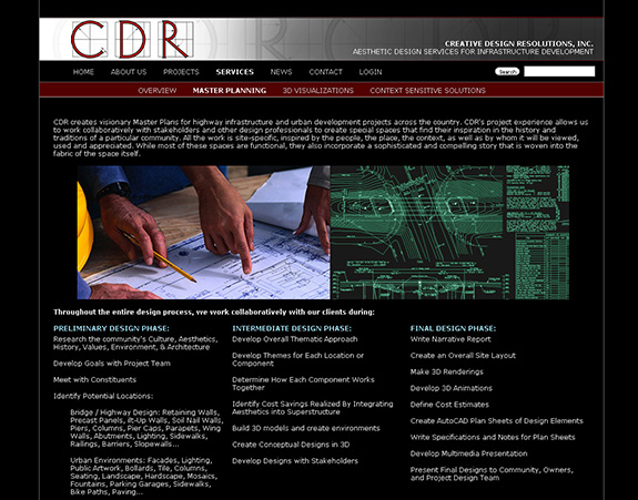
Screenshots of the higher level pages of the initial website.
User groups and goals
I worked closely with CDR’s marketing director, who had direct access to the website analytics and shared all necessary information for understanding the visiting audience and their behaviors when visiting the website.
The user breakdown was concluded as:
47%: State Departments of Transportation (investors)
34%: City Councils (investors)
15%: Construction/infrastructure/civil engineering firms (partners or sub – contractors)
4%: Other
The ultimate corporate goal was to target additional investments for the company and two other sister firms, increase partnership trust and secure collaboration with other sub – contractors.
Design management
I managed the entire design process from concept through implementation. I hired outsourced web developer with whom I was in close contact for the front end and function. We chose WordPress for Content Management System, but the entire front end was fully custom-designed in order to meet the business objectives of the website.
Information architecture
I worked closely with the stakeholders in order to establish the overall architecture of the site and relationship between the pages.
The architecture of the site consisted of three page levels except for the portfolio pages where additional page level was designated for project showcase.
It all started as whiteboard sketches, but I created an “official” presentation-ready diagram for internal discussions:

Content strategy
Working closely with the stakeholders and project manager, I collected all necessary data in order to get the overall high level picture of the site. Tons of content from the initial website was edited, modified and even deleted in order to leave only the portions that really mattered. There were many text-heavy sections with plenty of words that in the end, did not serve as attractors. Those sections were broken down into smaller pieces that would allow users to assimilate the information quicker and navigate quicker to desired destination.
UI design mockups
When designing the UI of the site, my higher level approach was to provide clarity, simplicity and visual appeal. In order to provide clarity, I structured the information n a way that user would be able to quickly scan the interface and easily find what they look for. Simplicity was achieved by using elements that do not distract users and clearly convey the information. Visual appeal was achieved by modernizing the UI to current trends, using large high quality images, enough white space and larger navigational elements. I used Photoshop Creative Cloud to create multiple design mockups which I presented to the stakeholders and internal team.